Talent mapping, data analytics, market mapping, market insights…those words are familiar, aren’t they?
In today’s world, data is taking more and more space and is inviting itself into all professions and industries. In recruitment, it’s not a secret anymore! Data is our best companion if we want to influence HMs and processes, advise and be the strategic Talent Acquisition (TA) partner of the future.
In this article, I will explain how to create a very simple visual talent map, to show where the candidates are based. It’s free, takes 5 minutes or so to create, and your Hiring Managers will LOVE IT!
If you follow the steps below, here is the result you will get:

Before starting the tutorial I’d like to thank my Business Analyst colleague, Amanda Chan, who has broadened my Excel skills by initiating me to PivotTables. Thanks to her, I’ve literally doubled my efficiency on Excel when playing with data!
THE TOOL BOX

Some of you might have an “insights” or “data” function on their ATS which allows to get this kind of visuals. This tutorial is for Talent Acquisition professionals who don’t have that option and need to do it manually.
You won’t need any fancy tools or software, only Excel and your brain! 😉
STEP BY STEP TUTORIAL

For this example, we have 146 candidates in a basic tracker (which can be either exported from a project or created manually).
- Have your tracker ready and beautiful. Make sure there are no typos in the location column. If the format of the location is not unified, go to the end of this article -> HELP!!!
- Create a new tab and name it Pivot
- Go in the “insert” tab, then click on “Pivot Table”

- Select your table from the Candidate Tracker tab and click OK
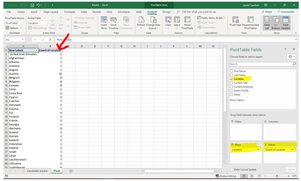
- In the PivotTable Fields on the right of your screen, choose the location field and add it in the areas “Rows” and “Values”. By doing this, you will get the number of candidates per location.
NB: If you modify the data from the Candidate Tracker, you will need to click “Refresh” in the settings under Analyse.
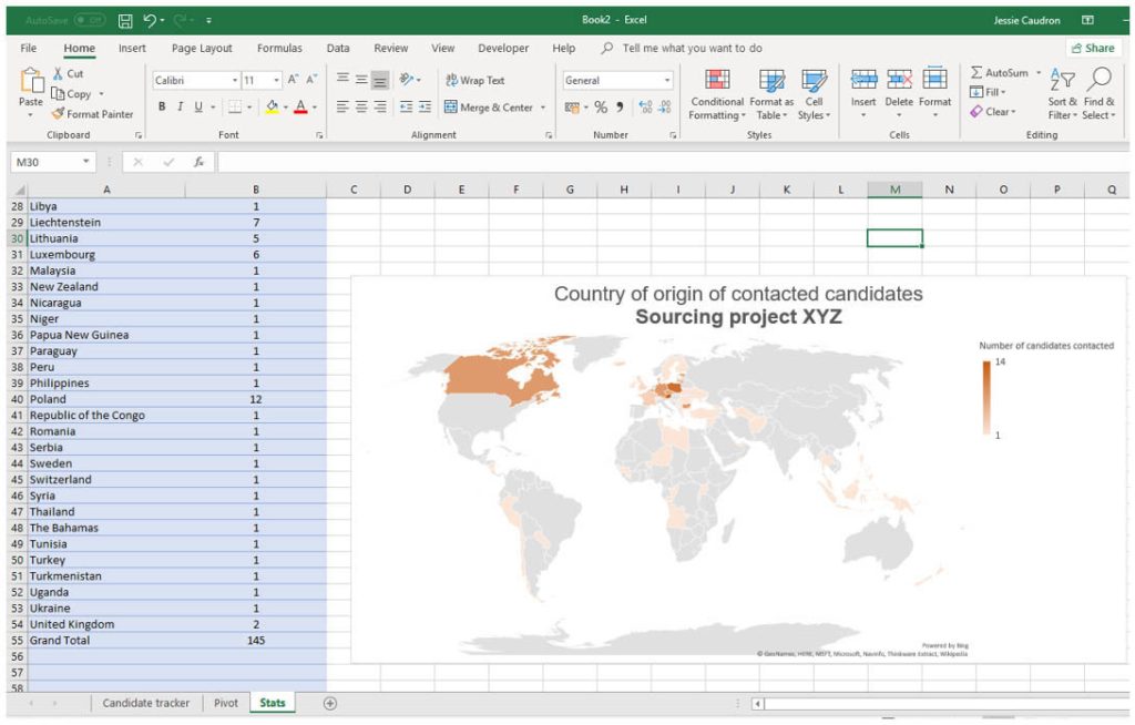
- Copy the table and paste it in a new tab (called “Stats” in this example).
The reason behind this step is that you cannot create some of the charts from a PivotTable
NB: if you want to work with live data (being able to edit your Candidate Tracker and have the chart being updated automatically), you need to import the data from Pivot to Stats.

- Once you did this, you just need to click on the “Insert” tab, then “Recommended Charts” and you will have the filled map suggested. Click on OK and tadaaa: you have your heat map of candidates!

- You can then edit the format of your chart (colours, titles, fonts, size etc…)
HELP!!! The data in the location column of my excel document is not uniform!
In case you use something like Quickli (a tool that I absolutely love) or DataMiner to extract your data and get the location information coming like this: London, England, United Kingdom; here is what you need to do:
- Copy and paste your location column into a new tab (Sheet4)
- Select your table with the locations
- Go in the “Data Tab”, then click on “Text to Columns”

- Choose what the delimiter is. In this case, it’s a comma.
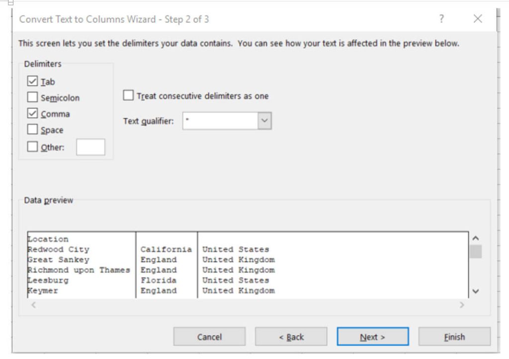
- Click Next and Finish

You can now go back to step 2 at the beginning of this article.
Enjoy! 😊


